← Back to Designs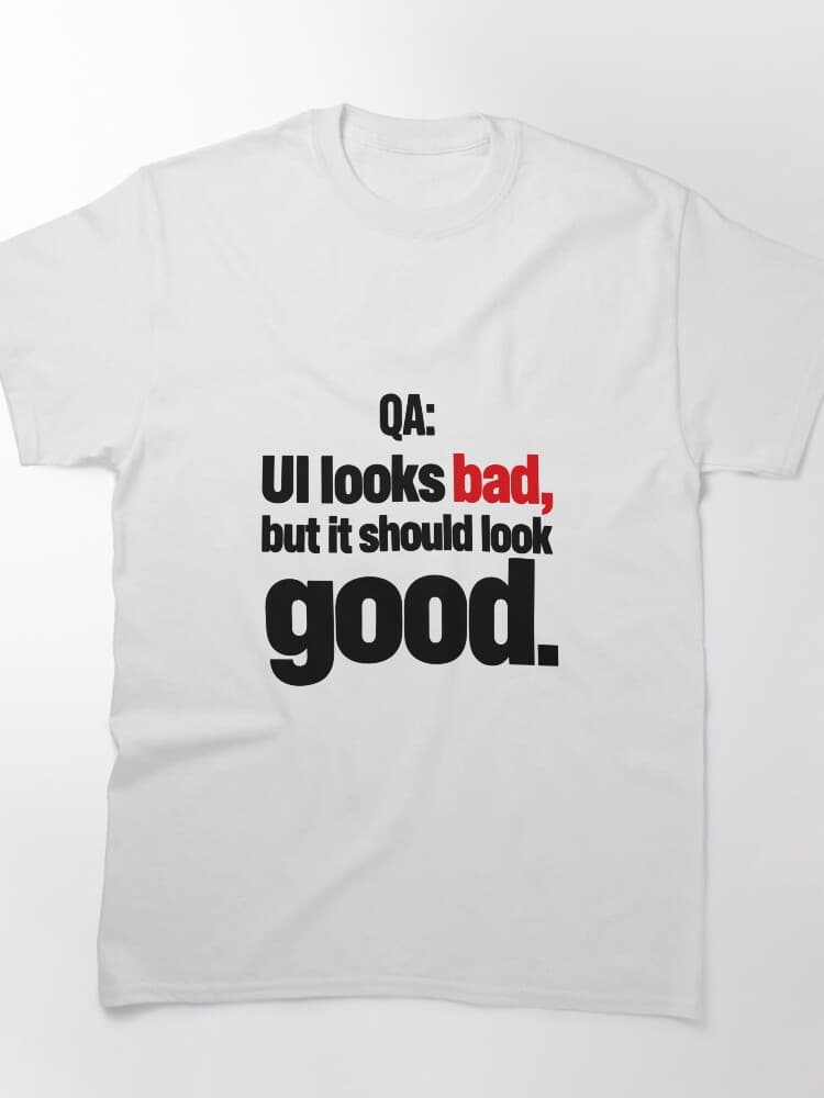 Buy on Redbubble
QA UI Looks Bad But It Should Look Good Funny Software Tester Typography
A bold editorial typography design featuring the witty QA slogan: UI looks bad, but it should look good. Stacked sans-serif text with a vivid red accent on the word bad gives it a punchy, magazine-style feel. A humorous niche design for software testers, quality assurance engineers, and developers who appreciate a good bug-report joke at work or tech events.
Created on: October 13, 2026
Printed & shipped by our marketplace partner. We may earn a commission — learn more
Buy on TeePublic